How to use Google’s CausalImpact
TL;DR in very simple terms
In this post, I will show you how to use a model developed by Google to understand whether a particular action had the desired effect on a particular metric (well, an effect, desired or not). There are several other tutorials on doing this online, but I hope that mine is simple enough so that you can follow it even if you’ve never written a line of code or taken a statistics course in your life.
(Long-winded) Introduction
There’s a famous adage in business that goes “half the money I spend on advertising is wasted; the trouble is I don’t know which half”. More generally, businesses often have a hard time evaluating the impact of their decisions — be they pricing changes, promotional discounts, new product launches, and so on. This is because there are many factors affecting business performance, and isolating the impact of a single one can be very difficult
Nevertheless, tech companies have become much better at doing this, because their scale and the nature of their business allows them to run experiments: say that a mobile gaming company wants to find out whether changing their in-game font leads to more usage; they can roll out different versions of the game to different users, and see which one performs better.
Unfortunately, there are times when running an experiment isn’t feasible: first, there are many companies whose business models are not inherently well-suited to running experiments. Second, even for businesses that could run an experiment, there are some times reasons not to: doing so can be expensive, the company may lack the engineering resources to set it up, or, perhaps, the company wants to analyse the performance of actions that have already been place.
In such cases, managers can use causal inference to estimate the effect of an action. This is a statistical approach that tries to predict how a variable of interest (for instance, sales, or user activity) would have evolved over time if a particular action (say, an advertising campaign) had not taken place, and compares that to what actually happened. The difference between the two is attributed to the action taken.
Doing this kind of analysis is difficult; thankfully, Google has released an R package that allows anyone to run causal inference.
Google CausalImpact
CausalImpact is an out-of-the-box model that performs the kind of analysis I described above. The mechanics of the model are too complex for me to understand, but the concept is simple enough: it creates a counterfactual and compares actual performance to it.
Unfortunately, I don’t think the user guide in the link above is very intuitive. So I’m writing this post as I’m learning to use the tool myself, in the hope that others may find it useful. I also hope that readers who spot mistakes in my approach will point them out.
Introduction to R
CausalImpact runs on R, ‘a language and environment for statistical computing and graphics’.
Some readers (those who have never user R, and certainly those who have never coded at all) may already be turned off at this point. Fear not — I’ve never used R before either, so I’m writing this post assuming no prior knowledge of the language, or coding in general. Honestly, you should be able to follow this guide even if you’ve never written a line of code in your life.
Step 1: download R. This is straightforward — don’t let the 90s look of the website discourage you. Just find your OS’s version of R, and install it.
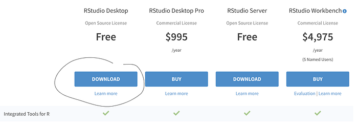
Step 2: install the RStudio IDE. IDE stands for Integrated Development Environment, which is a program (‘app’ for people born after 2000) you use to code. Again, this is easy to do — just download the free RStudio Desktop.

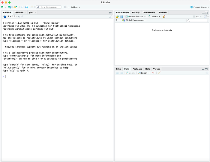
Step 3: once installed, launch RStudio. It should look like this (if you’re on Mac at least):

Prepare a file for causal inference
Start a new Google Sheets file. On the first column, input the time dimension. To keep thing simple for now, input number of days before and after the intervention. On column B, input the variable whose value you are interested in; this is called the response variable. On subsequent columns, input control variables — i.e. variables whose value correlates to the response variable.
For example, suppose you want to find out whether a new TV ad campaign in the UK boosted sales of your product. Your response variable is sales in the UK. Let’s say you are measuring daily sales; then, in column A you will input the sales for a period of time before and after the start of the campaign — let’s say 100 days before and 100 days after. In column B, you’ll input sales in the UK for that day.
Now you want some control variables. Suppose you think sales in Ireland, Germany, and France follow roughly the same pattern as those in the UK. Suppose also that you did not run a TV campaign in those markets. You can then treat sales in those markets as control variables.
When all’s said and done, this is what your file will look like:

So row 2 shows sales by market 100 days before the campaign went live, row 3 sales the 99th day before the campaign went live etc. (Important note: the screenshot above shows the values formatted as numbers. However, the commas may confuse R into thinking the values are text, not numbers — so to be safe, avoid any formatting.)
Now, save your file as a CSV file on your computer:

Run Google CausalImpact
Open RStudio, and in the box on the left, type
install.packages("CausalImpact")And hit enter. This may take a few minutes to run. Once that’s done, type
library(CausalImpact)Now we want to load the file we created into R. So type
df <- read.csv(file.choose())This will launch a window for you to select the CSV file you created. Find the file and load it. R will save the contents of the file in the variable ‘df’. However, this is not yet in a format that R can process, so we need to write a few additional lines of code.
First we need to load the sales data. We do this with the following commands:
uk_sales <- ts(df$uk_sales)
ireland_sales <- ts(df$ireland_sales)
germany_sales <- ts(df$germany_sales)
france_sales <- ts(df$france_sales)
‘ts’ creates a time series — basically a sequence of numbers; df$column_name tells R to pull the values in the column specified from the df variable (which is where we loaded the file). So, for instance, df$uk_sales tells R to go to the file saved in df, find the column labelled ‘uk_sales’, and save all numbers in that column, in the order in which they appear in the file, in the variable ‘uk_sales’.
Finally, we want to combine the sales data in a single table. We do this using this command:
data <- cbind(uk_sales, ireland_sales, germany_sales, france_sales)By now, we have effectively re-created the Google Sheets table in R. You can check this by typing ‘head(data)’, which will display the first few rows:

Then, we need to define the pre and post periods:
pre.period <-c(1,100)post.period <- c(101, 201)
This tells R that the pre-period is the rows 1 to 100 (100 days before to 1 day before the TV campaign), and the post period is rows 101 to 201.
Finally, we can run the analysis:
impact <- CausalImpact(data, pre.period, post.period)This runs the model, and stores all relevant results in the ‘impact’ variable. Once that’s done, we can take a look at the results:
plot(impact)This will produce something like this:

The black line in the top chart is the actual daily sales; the blue line is the model’s prediction of what sales would have looked like sans the campaign. The second chart shows the difference between the two. Eye-balling this, it looks like the model thinks the campaign did have a modest impact on sales (since the blue line in the second chart is above 0).
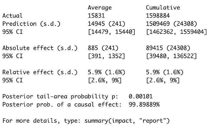
You can also see the results in a table if you write ‘summary(impact)’:

Here we see that the model thinks the relative effect of the campaign was a 5.9% uptick in sales. In fact, the data set I used for this example was made up, and I had incorporated a 5% increase in UK sales in the post-campaign period — so the model came up remarkably close.
If you are a a words person, write summary(impact, “report”):

What if my action does not have a single start date?
In some cases, you may be interested in actions that do not have a specific start date affecting your variable of interest. For example, suppose you worked for FB circa 2007. The iPhone comes out, and soon enough, everyone starts using apps. So you launch the FB app. Now, the question is, does the app drive more user engagement?
The first problem is defining a metric that summarises user engagement — for example, the percent of users who launch the app or log in on desktop at least once per week.
But the more serious problem is, how to define pre- and post-periods? The naive solution is to set the launch of the app as date 0, but the problem here is that not all users will install the app at the same time. A better solution is to create a table where each row is a date & user combination, with the following columns:
- date
- user identified
- days before / after the particular user has installed the app
- a marker on whether the user was active any of the previous 7 days
You can then use this data to create a second table, with the columns we’re really after: days before/after app install, and % of active users. This looks like this:

The table on the right looks like the table we used in the TV campaign example. The difference is that in the earlier example, each row corresponded to one calendar date; here, each row corresponds to a time period relative to a given point in time.
This means you can use CausalImpact, but it does have two big downsides:
- It’s harder to pick a control group: since each row is defined as behaviour before or after a specific action users took, and given that by definition, a control group hasn’t taken the action, how do you map the behaviour of controls to the before/after values? (One hacky solution: take the weighted average of the control users’ behaviour. For instance, suppose that day 5 post app-install shows the behaviour of 5 users who installed the app on January 10th, 3 on April 2nd, and 1 on May 4th; then, your control value for day 5 should be = (average active rate for users who didn’t install the app at all on Jan 10th x 5 +active rate on April 2nd x 3 + active rate on May 4th)/9. Another solution is to use another behaviour from those users, besides active rate; but you need to be sure that that behaviour is not impacted by the launch of the app).
- You are introducing a lot of noise: day 10 post-app install may be Christmas day for one user, and July 15th for another; so there may be seasonality effects, as well as a plethora of other cofounders that you cannot easily eliminate.
Still, it’s a start!
Words of caution
So there you go — follow the instructions above, and you should be able to run your own causal analyses within 10 minutes. But do keep in mind that your analysis will only be as good as your control groups. In particular:
- You need to pick metrics that correlate with the thing you’re interested in, but that were not affected by the action you want to evaluate. It is important that these control variables correlate both in the before and after period.
- You must also be confident that there aren’t other factors affecting your response variable, without affecting your control variables.
I hope you enjoyed this post — if you spot any mistakes, please let me know in the comments. If you liked this post, you may also enjoy my series on financial management.
If you liked this post, you can follow me on LinkedIn or Twitter
